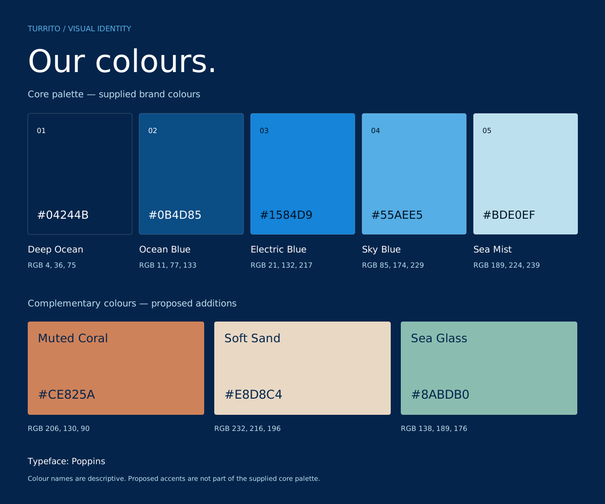
01 — COLOURThe core palette
Our colours.
Depth, clarity and a connection
to the ocean.
Five blues make up Turrito’s core palette. From deep navy to the lightest sea blue, each has a role in creating a clear, consistent identity.
Click a swatch to copy its colour code.HEX for websites and digital design.
01 / Foundation
Let deep navy carry the design.
02 / Emphasis
Use brighter blues to guide the eye.
03 / Restraint
Keep the palest blue as a light touch.
02 — COMPLEMENTARY COLOURSProposed additions
A little warmth.
A fresh perspective.
Keep blue at the centre. These suggested additions bring contrast to highlights, campaigns and supporting details without overwhelming the palette.
Start with muted coral.
Its orange undertone contrasts with Turrito’s blues, while the softened finish keeps it professional. Use it sparingly: one key detail, button or highlight at a time.
03 — COLOUR IN USESuggested direction
Blue leads.
Contrast supports.
Start with a dark foundation, add clear white typography, then introduce a small accent. Select a colour to see the balance change.
 ILLUSTRATIVE BRAND APPLICATION
A CONNECTED APPROACHConnected thinking.
Connected thinking.
Specialist depth.
Clear ideas. Thoughtful technology.
Room for what comes next.
Deep Ocean + white + Muted CoralPoppins / Semibold
A useful starting point
Suggested balance for a dark composition. Adjust to the medium.
Deep navySupporting bluesAccent
Clear, readable combinations
Calculated contrast for the exact colours shown.
These examples meet the 4.5:1 WCAG AA contrast threshold for normal text. Recheck contrast when changing colours or adding transparency.
04 — TYPOGRAPHYOur typeface
Poppins.
Geometric. Clear. Approachable.
One family, a consistent voice.
ABCDEFGHIJKLMNOPQRSTUVWXYZ
abcdefghijklmnopqrstuvwxyz
0123456789 & @ ! ?
abcdefghijklmnopqrstuvwxyz
0123456789 & @ ! ?
Ag
Regular / 400
Body copy and longer reading.
Ag
Medium / 500
Navigation and supporting labels.
Ag
Semibold / 600
Headings and key messages.
Ag
Bold / 700
Short moments of emphasis.
05 — OUR LOGOSupplied brand asset
Distinctly Turrito.
Use the full Turrito logo or the standalone jellyfish icon. Keep their proportions intact and give each version space to breathe.
Keep it intact. Scale proportionally, with enough room for the tagline to remain legible.
Choose the right version. Use the Electric Blue and Ocean Blue logo on white, and the white-and-blue logo on deep navy. Keep the colours exactly as shown.
 #1584D9
 #0B4D85
Icon option
The jellyfish, on its own.
Use the standalone mark for compact brand moments, profile images and app icons. Keep the full jellyfish visible, with clear space around it.
Electric Blue on navy. Ocean Blue on white, matching the full logo. Both downloads have transparent backgrounds.
06 — TAKE IT WITH YOU
Ready to create.
Keep the core palette close. Proposed accents are labelled separately in every download.
Logo for white backgroundsElectric Blue wordmark with Ocean Blue jellyfish and taglineSVG ↓Logo for navy backgroundsWhite wordmark with Electric Blue jellyfish and taglineSVG ↓Standalone jellyfish iconOcean Blue #0B4D85 on a transparent backgroundSVG ↓Colour paletteAll eight colours in a single reference sheetSVG ↓Colour variablesCore colours and proposed accents for digital useCSS ↓Colour valuesHEX, RGB and approximate CMYK valuesJSON ↓Poppins font familyGet the font from Google FontsFONT ↗